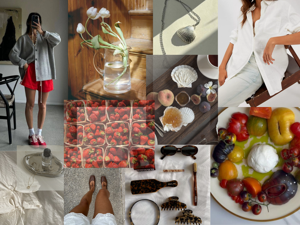
Each season seems to arrive with at least a few prominent hues. Most pass as quickly as they appear, only to feel dated a few months later, but Poppy is different. It has a genuinely elegant element that can’t be replicated through red or orange alone, but rather occupies the richer space between the two. It's warm without feeling heavy, vibrant without being loud and optimistic without ever reading too precious. Unlike brighter reds or sharper oranges, poppy never demands to become the entire palette; it rather changes the temperature of things.

COLOR STORY: POPPY
.png?v=1784951755639)
After years of oat, mushroom, camel, and every imaginable shade of quiet dominating both homes and fashion, poppy feels like the antidote to beige-everything. Not because our beloved neutrals have fallen out of favor, but because even the calmest palettes could use a note of conviction.


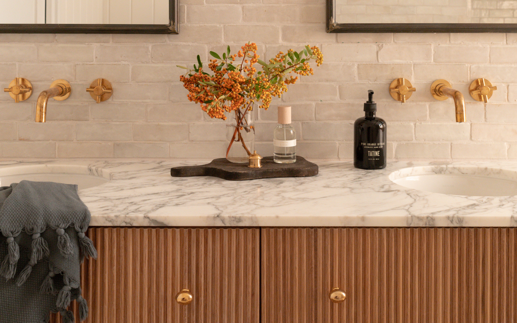
Poppy shows up with confidence, allowing everything around it to remain calm. That’s what makes this hue feel elevated rather than overwhelming. Poppy has an unusual ability to celebrate the materials beside it rather than compete with them. Walnuts feel deeper, linens look lighter and aged brass becomes warmer. Faded indigo hues found in vintage rugs suddenly appear more vibrant next to poppy. It perfectly complements natural materials instead of distracting from them.


There's something especially right about it this time of year. Poppy lives in striped umbrellas along the Mediterranean, tomatoes still warm from the vine, cafe awnings faded by decades of salted air, tables filled with stone fruit and conversation that stretches in deep sunset. We love poppy for its ability to be cheerful without being too playful, and rich without feeling too formal.


The best rooms, much like the best wardrobes, rarely rely on more than a few confident pieces. Even one intentional decision where a louder color is considered is often all it takes. The quiet confidence of poppy: it doesn't ask to take over, but it does command to be noticed.